
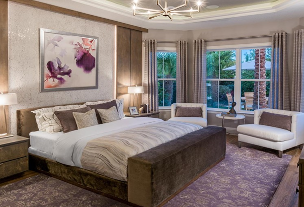
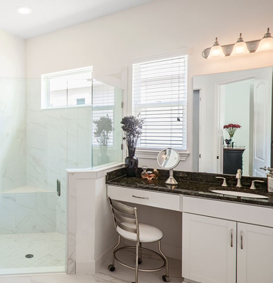
Have you ever gotten the urge to paint a room in your home and sent a picture to a friend for advice on a color selection? Recently, a friend emailed me a picture of her primary bathroom. She wanted to repaint it to complement her primary bedroom. She had initially gone to a big box hardware store and selected what she thought would be a good match for her bath. But when she got home, it was all wrong.
Understand, this friend did not live in my city, hence the reason for the photo. Take a look at these photos (below). With so much variation, how can anyone be expected to pick a color from a picture?

To make an accurate color selection, you 100% need actual color samples. While cell phone cameras have come along way, you can’t rely on the images for true color representation. You don’t have to take my word for it. Take a picture on your phone of something colorful and email it to yourself. Now objectively compare the photo you took on your phone or shown on your laptop and compare to the actual object. Are they the same? Are the blues more green, the yellow faded or the red slightly more orange? When making color selections, these variations in shade and color are compounded. Bottom line: Images won’t work.
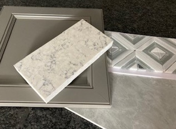
Since using photos isn’t a viable option, the next best thing would be to take actual samples to the big box store and put them side by side next to the paint samples. We can do this in new construction, but since this was an existing bathroom, this wasn’t possible.
I also noticed the lights in her bathroom were wall mounted decorative sconces over the mirror – most likely incandescent light bulbs. Have you ever looked up at a big box hardware store at their lights? I can guarantee that they are not incandescent. There once was a time when they would be fluorescent or mercury halogen lights, but certainly not full-spectrum light.
The next option is to take a variety of paint chips from the store to the bathroom and view the colors adjacent to the finishes and in the same lighting condition. Chances are, you might get close to making a reasonable choice – but do you have the confidence of painting an entire room based upon such a small sample? Will you be kicking yourself when you decide it’s not a good match after you’ve spent money, time, and energy (perhaps on your day off, no less) to meticulously paint the room? When you consider all that time, money and effort, maybe there’s a better way to be certain of your selection.
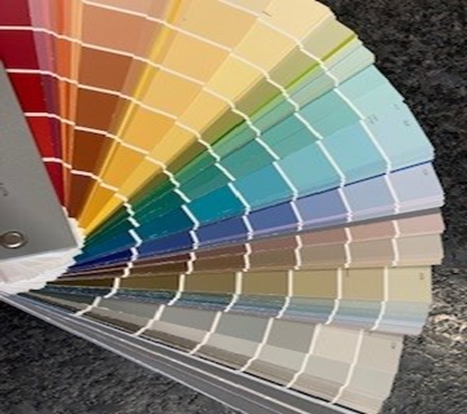
Sample paint cans are available at most paint stores. Pick three or four different colors, take them home and apply each color to the wall in the room, next to your finishes in your specific lighting conditions. This allows you to make a more informed decision without the agony of painting an entire room the wrong color.
The same dilemma exists when trying to pick exterior colors. If you pick them inside a paint store, you won’t get an accurate idea of your final color. Not only will there be a color shift, but the bright sun will wash out what you thought was a dark color or contrasting color. Testing your paint selections outside will be an eye-opening experience.
To put it bluntly, you don’t want to end up with your house looking like this…

The takeaway is to always try to view your paint tones under the actual light source of their final placement. If you have the luxury of time and can paint samples before the final decision, this is always the safest and most effective strategy. Trust me on this one!
Adapted from Housing Design Matters Blog